The forecasts are subject to scenarios, which are often misunderstood. A GCM can calculate all sorts of things, but some have to be supplied as inputs. CO2 is the most notable; climate science can't predict how much carbon will be burnt. Volcanoes are another. But there is also TSI, other trace gases. More marginal is ENSO. Only recently have GCM's been able to compute it, so it can make sense to treat it as a forcing, subject to scenario.
Scenarios are not predictions. You have to calculate a range of them to have a chance of getting a result that will correspond to what really happened. When you look back, the sole test of which scenario to apply is what corresponds best to the history. It doesn't matter what Hansen or anyone esle thought was likelier. You check against the scenario that fits what happened.
However, I'm not talking here about scenario confusion, but a more basic issue - what observation dataset to use. It's prompted by a post today at WUWT in which the predictions were rated against satellite indices for the lower troposphere. That certainly wasn't what Jim Hansen was predicting.
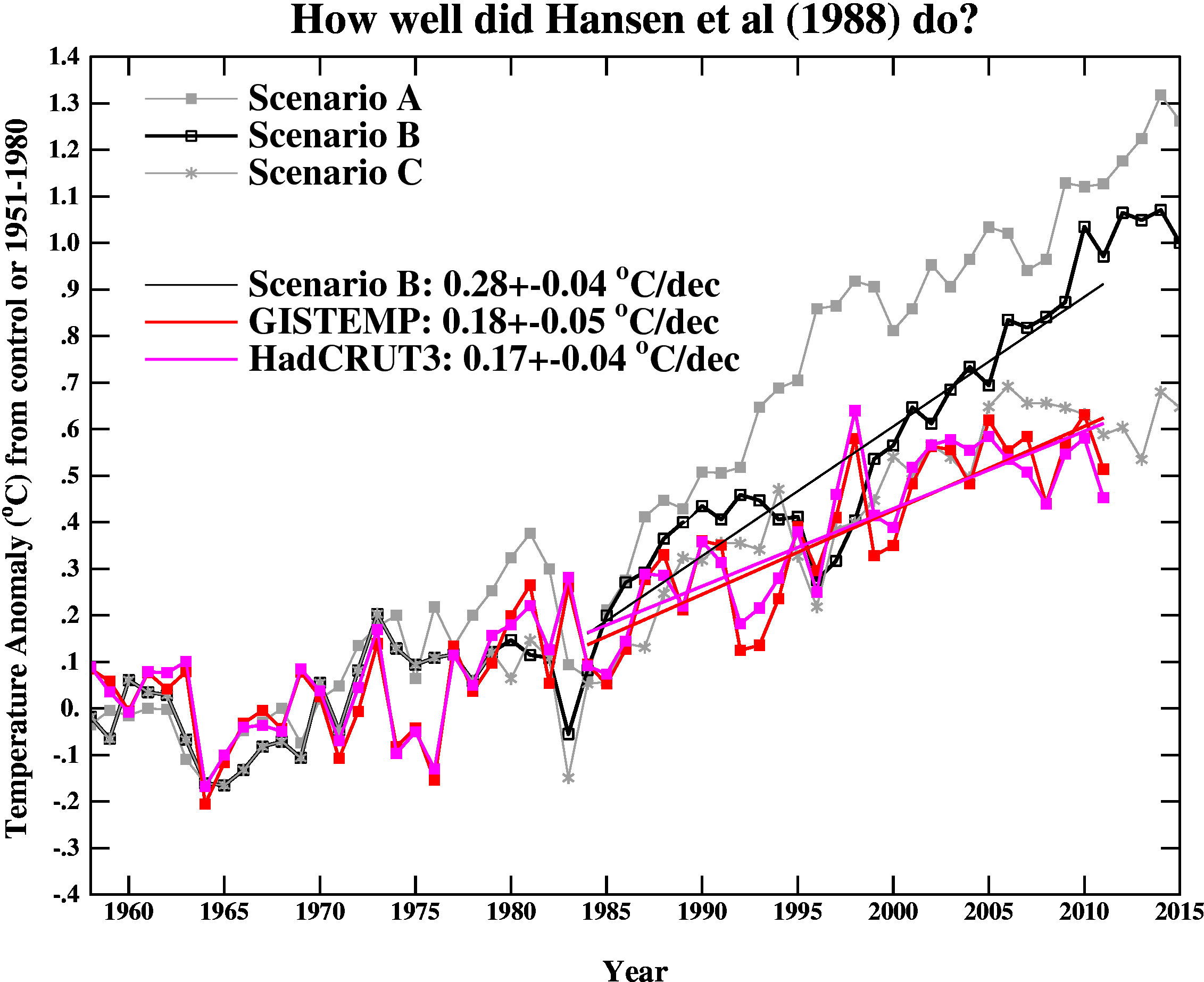
We know what actual index he had in mind, because he graphed it against model results. It was the index compiled from meteorological stations, described in the paper of Hansen and Lebedeff 1987, the year before. This eventually became the GISS Ts index. I believe that is the index that should be looked at first. The more modern Land/Sea indices were not available in 1988.
However, there is an argument that Land/Ocean indices are a better representative of GMST, and Real Climate, in their periodic reviews of model predictions and observations, use the GISS and Hadcrut Land/Sea indices. I think this is a little unfair to Hansen, as they rose more slowly than the GISS Ts. But there is a rationale.
So here is where a JS/HTML 5 graphic can help. I found out how to incorporate bitmaps in HTMS 5 canvases, so today's active plot allows you to choose from a wide variety of indices, and superimpose them on Hansen's original graphic.
Anomaly offsets
With multiple indices there is always an issue with differently calculated anomalies. Here I used the GISS Ts index unchanged; it does (still!) match Hansen's observed data in the overlap period. I then shifted the other indices so that they would have the same average as GISS Ts from 1980 to 2009 (30 years). But I've allowed users to modify this offset if they have a better idea.So here is the plot. Below is advice on how to use it.

|
Mechanics
You can draw the plot of any dataset by clicking the radio button. This is not a toggle, and the plots cannot be individually erased. But there is a clear all button at the bottom, which also sets the offsets to zero. As foreshadowed, you can set your own offset by entering a number in the input box beside each dataset, or you can set a global value. What you write in a box is operative for the next plot. You can click again on a radio button if you want the same data with a different offset. The global and local offsets are additive - you probably don't want to set both. The clear all button will set all offsets to zero - ie to match GISS Ts as above. Added: Ron Broberg in comments linked to this plot that he made of an update to the TS 26 fig of the AR4 Tech Summary. The dots before 2006 are Brohan 2006, after they are HADCRUT 3v.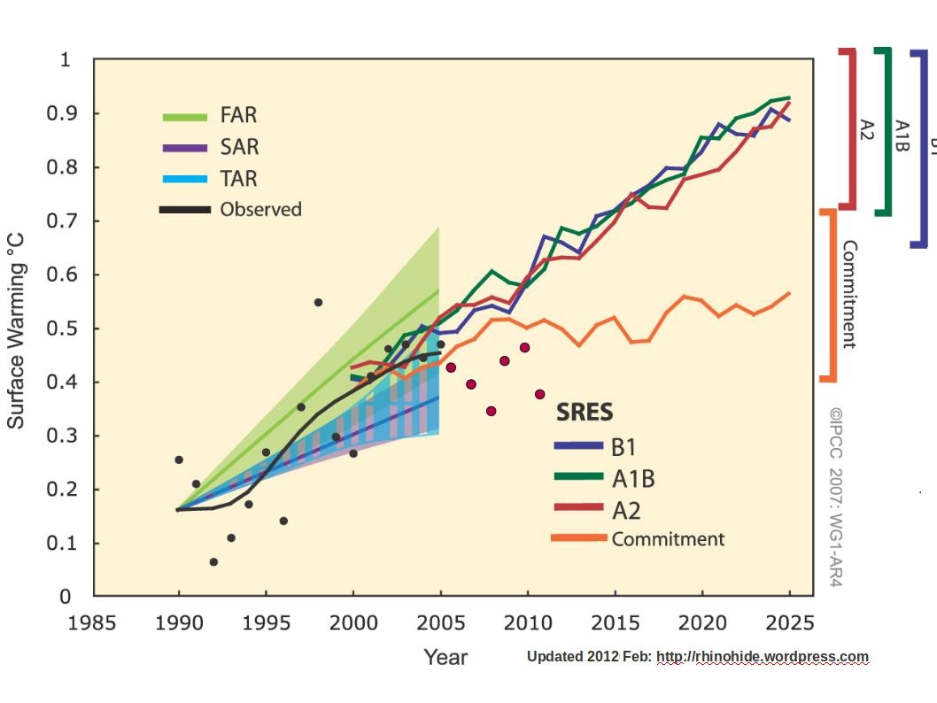 The RC plot that he linked is here. It's from the article linked above.


http://www.realclimate.org/images/hansen11.jpg
ReplyDeleteThe following is a graph of “model projections” of global temperatures as depicted in the IPCC AR4.
http://www.ipcc.ch/publications_and_data/ar4/wg1/en/figure-ts-26.html
And here is the same chart with updated observations.
http://www.rhinohide.org/gw/publications/ipcc/ar4/img/ts26-updated-2011.jpg
The added observations are HadCRUTv3 and are only ‘hand-fitted’ to the chart via an image editor.
(Comment by Ron Broberg — 25 Feb 2012 @ 2:53 PM)
Thanks, Ron,
ReplyDeleteI'll see if I can offer that as an alternative background. I've added your plot and link above.
Just FYI, the first line in that Anonymous comment is not mine. Someone else added that first line unto a comment I made at RC, deleted my first line, and reposted the spliced comment here. Don't know who but I am not entirely thrilled that my words are being reposted under my name with someone else's edits. (Not your fault, Nick)
ReplyDeleteFor the interested, the missing line is "Be careful of binary positions regarding IPCC modeling." and the original comment is here:
http://www.realclimate.org/?comments_popup=11066#comment-228926
I am interested in taking a look Hansen 1988. But I would go about it by taking GISS ModelII and running it with the actual forcings from 1985-2011 and comparing the model results to real obs. I poked at this for a few weeks last July and have been able to compile but not run GISS ModelII. Recalling the original challenges with GISTEMP, it could be the big-endian/little-endian issues biting again. But more broadly, I just didn't grok the architecture. So for the nonce, I have shifted my attention towards a simpler model - UVic_ESCM - that I will be able to understand. As an alternative to ModelII, EdGCM is stable on modern computer platforms, but while it has roots in ModelII, I don't think it is close enough to act as a stand-in for the Hansen 1988 model.
In other words, I am less interested in matching the scenario output to obs as I am to matching real-world-forcings to obs.
And, one more thing, I don't think that the IPCC AR4 TS26 which summarizes modeled projections of surface warming for FAR, SAR, TAR, and AR4 has much relevance to Hansen 88. No particular reason to conflate them.
ReplyDeleteBut now I am curious about the model's history after 1988. Let's take a peek.
TAR: GISS 1: Miller and Jiang : "Improved version of Model II"
TAR: GISS 2: Russel et al : "is a variant of the version published by Hansen et al. (1983) (henceforth called "Model II")."
SAR: GISS 7 : Russel 1995
SAR: GISS 8 : ???
FAR: Hansen 1981, 1984 used in equilibrium 2xCO2 experiments : (documented as
model II (Hansen et al., 1983b...))
FAR: GISS not mentioned in dynamic experiments
Very cool Nick. Thanks!!
ReplyDeleteNick, one of the issues with this obs-model comparison are events such as Pinatubo.
ReplyDeleteCan you include some variation of Foster and Rahmstorf 2011?
http://iopscience.iop.org/1748-9326/6/4/044022/fulltext/
Ron,
Deleteyes, I could. I did do a post on F&R here.
One complication is that Scenarios B and C do allow for volcanic explosions at times which were pure guesswork, but one in 1995 very nearly matched Pinatubo.
Ah. I knew that once.
DeleteAs a side note, modelII is running fine on a clean install of 10.04 Ubuntu. The only significant differences between now and my failed attempts this fall are 1) direct host install -v- Vbox VM and 2) US power -v- German power. :shrug:
Of course, this modelII has 15+ years of improvements built in since Hansen 88
It'll be interesting to see if it can be unwound.
Nick: Neat!
ReplyDeleteTo some extent the divergence can be explained by an increase in co2 sink capacity perhaps. Photosynthesising biomass grows faster when the is more co2 in the air, and copes with aridity better too.
So despite a ~15% increase in human output of co2, the airborn fraction isn't increasing at the expected rate. Hansen forecast an increase to 390ppm by 2010 under scenario C, which was for a significant reduction in human output. Well, here we are at around that figure despite a significant increase in output.
The world does not stand still in the face of change.
Unlike some theorists. ;-)
TB,
DeleteFirst my apologies for the hiccup in this post - it went into moderation for some reason - it shouldn't have.
I'm not sure that airborne fraction is expected to increase. I'm not aware of any predictions about it - the observation has been that it is quite stable. Biomass may indeed grow faster - it would then behave like the sea, where CO2 conc increases with air conc at constant AF.
I realised the problem with moderation. A while ago I had a problem with spam, and set moderation to operate on threads more than 3 weeks old. I've removed that now.
DeleteOn the volcanoes issue, did you see my post here?
ReplyDeletehttp://tallbloke.wordpress.com/2012/04/18/uncertainty-the-origin-of-the-increase-in-atmospheric-co2/
Regardless of when actual eruptions occur, there is a lot more annual release of co2 from old lava fields than the models have been allowing for.
TB, A question I ask people who propose alternative sources of CO2 is - OK, what happened to the CO2 we know we put into the atmosphere? If there's more from elsewhere too, then how does that add up?
DeleteAnd when people nominate volcano sources, then the question is, why now? If there has been such a nett flux from volcanoes in the past, why hasn't it accumulated?
And if the answer is, well it's just a transient, then why have we not seen other transients in the last 400000 years?
Basically there is a big logic jump to overcome. We've put about 350 Gtons of C in the atmosphere. It's showing about 200 Gtons increase. Why do we need an extra CO2 source to explain that?
There are a lot of other problems with CO2 release from natural sources being a more important source of CO2--the issue of changing isotopic ratio must also be explaine.
ReplyDeleteI think Eric gives a pretty clear explanation here. YMMV.